So much of our retail design can be used to tap into our customer’s minds. Often, shopping is driven by emotion, rather than practicality. If you know a little bit about how the mind works, you can encourage customers to spend more and return often, helping to keep your profit margins healthy, even in economic downturns.
Here are a few tips you can use to boost sales via customer psychology.
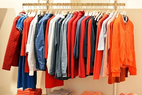
Bring some colour to your shop fittings
Colour psychology can play a huge part in your retail store design. Did you know that 62 -90% of first impression is based on colour? That’s what research by Satyendra Singh from the Department of Administrative Studies at the University of Winnipeg in Canada found. The study showed that colour influences the snap decisions made by shoppers, persuading them to buy, or repelling them from a store.
So, the colours you choose to have in your retail display can influence an action that you’d like your customers to take. For example:
- Choose red to encourage action and impulse purchases
- Choose orange to promote happiness and motivate sales
- Pink makes your store seem caring and feminine
- Yellow is cheerful and grabs attention, making it ideal for shop windows.
- Choose green to promote an atmosphere of peace and tranquility.
- Blue encourages customers to trust a brand and feel calm in its presence
- Purple adds a luxury element to shop fittings and can be soothing.
You can create colour zones throughout your store to best enhance the customer’s shopping experience. Red and oranges around the till help with impulse buying, while yellow in shop windows draws attention. If you have a luxury line of clothing, make your décor purple, and blue is ideal for changing rooms where customers feel at their most vulnerable and tend to judge themselves the most.
Variables of colour psychology for your retail display
Of course, it is about more than just the colour. The tone and shade you use matter too – for example, blue is a warm, welcoming colour, unless it is too dark. Then it can make a customer feel lonely and detached. Green is a lovely earthy colour that makes the customer feel connected, but too dark, and it can trigger feelings of disgust! And yellow is incredibly eye-catching, but too much and it can become overwhelming. It is important to balance these emotions.
You will also need to consider your brand demographics, as they will have slightly different responses to each other. For example:
- Choose blues, purple, and green to attract women. Avoid orange, brown, and grey.
- Choose blue, green, and black to encourage men into your store. Avoid brown, orange, and purple.
- Blue is your safest colour if your target market is particularly broad, as it appeals to the majority.
The wrong colours have the potential to ruin your store, so it is important to get this bit of retail design right. Not only must the colours entice your target audience, but they should also fit well with your brand, and complement other fixtures and fittings in your home. That’s what makes this such a challenge to get right!
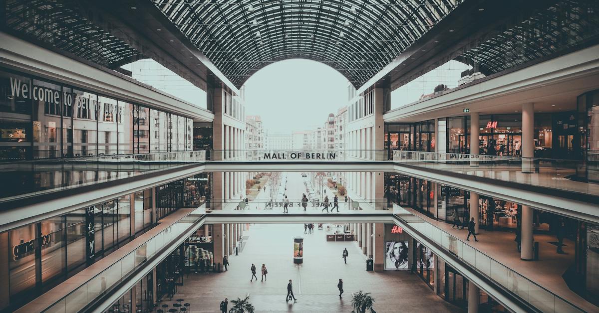
The layout is important in your retail store design
Start to the right of the door
Most people are right-handed. So, when they enter a store, they turn right first. This is the best place to put your core store offerings and promotional retail displays, as customers will see these straight away upon entering your shop.
Then, position the rest of your goods in an anti-clockwise position around your store. Take the customer on a journey that ends with a basketful of purchases at your till.
Create a decompression zone in your retail design
There is a theory that suggests customers ignore everything they see in the first 10-15 feet of the front door. Best-selling items tend to be stocked just past this ‘decompression zone’. That doesn’t mean that the decompression zone is lost space, however. You can use it to create store displays that entice customers into your shop.
This zone also helps reduce clutter around the entrance. You can repeat any items that fall into the decompression zone, placing them further back in the store again so customers are more likely to consider buying them.
Make space
Give your customers room to move past your racks of clothes and other shoppers. While it can be tempting to use every square inch of space to sell clothes, you’ll make a much more pleasant atmosphere in the store by spreading things out. And your garments are less likely to get damaged in the bargain,
If a shop feels overcrowded with shop fittings, customers will leave. So, make space for more customers, and they will come!
Add grabbable items to the queue area
Your customer is almost at the end of their shopping journey. But, if you add a few low-cost, small items in baskets near the till, they are more likely to add them as an afterthought while waiting to be served. It’s a sneaky trick in retail store design that a lot of stores use successfully.
Consider shelf height
Shelves that are too high will prevent people from seeing what is on them. And they certainly won’t be able to reach up to take items down for their baskets. And shelves that are too low will have a similar problem, forcing people to bend over uncomfortably. The best shelves sit between chest and eye height. This is the perfect space for customers to browse without having to move their bodies too much – and they can easily reach the items they want.
Getting your retail design right can be a minefield, but it is so important for healthy sales. Luckily, you are not alone. As well as offering you all the shop fittings you could possibly need, we are also quite handy for advice. Get in touch with all your retail display dilemmas and we can help point you in the right direction so that your shop is always perfectly presented.
After all, our success relies on your success – we are in this together!