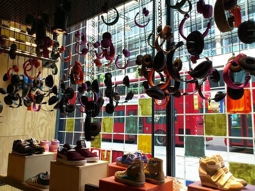
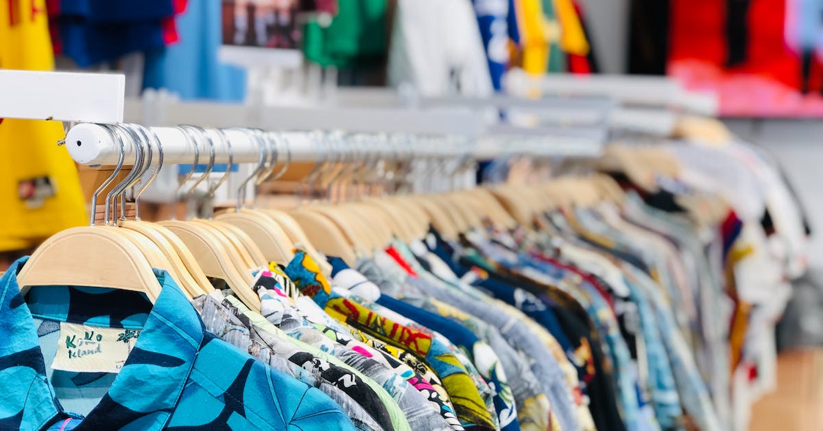
One of the most important aspects of visual merchandising for retailers is colour. Too bright and bold and your message and products will be lost, too dull and drab and you will not capture the attention of potential customers. When considering your next shop window display or in-store feature, your primary focus should be on colour. So, how can you use colour in your visual merchandising to influence customers and increase sales?
Three colour tips for visual merchandising
1. Backdrop
A colourful backdrop can attract attention instantly. However, a bright backdrop can then clash with the products that you display. For ideal visual merchandising, you need to balance the backdrop with your display goods.
You can play it safe by adopting a neutral-coloured background, and then you can focus on the colour of your products. Alternatively, if you have monochrome products to present in your window, then a bright, colourful backdrop may work perfectly.
For a neutral and timeless backdrop consider white, grey or pale blue.
2. Emotional significance
Colours can truly resonate with consumers, and your colour scheme may invoke an emotional response which can lead people to have an opinion on your brand and visual marketing methods. For example, many brands are synonymous with a specific tone or shade. Using these may mean your audience could be confused between you and a competitor.
Colours are also highly-emotional which can help your display if you want to promote a specific feeling from your display and products.
Colours that trigger certain emotions include;
- Blue for calming and relaxation
- Yellow for summer and happiness
- Red for excitement
- White for cleanliness and clarity
- Purple for luxury and richness
- Orange for energy (orange also taps into our hunger which means it is an excellent colour for eateries and food vendors).
Colours can also create a feeling through association. For example, green is associated with environmentally-friendly activities. This could be good if you want your brand to promote its eco-friendly attributes.
3. Telling a story
As well as invoking emotion, colours can be used to enhance a specific theme that you want your display to get across. Colours can help you to set a scene for your products. To create a relaxed summer meadow, you would choose lush greens and sparkling yellows. While an underwater theme will draw on emerald green, turquoise and green/blues.
Of course, one of the prominent choices for colour stories is the seasonal offerings. Many shops will use pink and red to create a Valentine’s Day scene, bright colours for summer holidays, while festive red and green are used to promote Christmas seasonal goods.
Chosen your visual merchandising colours?
Once you have chosen your colours for your next display, it is time to start pulling the design together. If you need visual merchandising equipment from mannequins to display stands, then Valentino’s Displays can help. Operating as a convenient shop for shops, we can advise you on the perfect display equipment to suit your visual merchandising needs. For friendly advice, give our team a call on 01489 808007.


