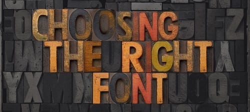
Font choice is often overlooked in DIY promotional materials, a last-minute decision just before printing, perhaps even left as the automatic font, but font choice is important.
If you’re designing your own promotional materials, it’s likely a cost-saving strategy rather than because you’re a budding graphic designer stuck in the wrong job. We’ve created a straightforward checklist to help you avoid any printing disasters and ensure you have the perfect font every time.

Source: dreamstime.com
1. Does your font choice fit with your brand?
Ask yourself what your brand stands for. Is it ethical, fun, elegant or loud? Do you have any particular colour palette that represents your brand?
If you don’t know the answers to these questions, brainstorming the qualities and characteristics that make up your brand is a good starting point. You can then ensure you choose a font that captures these qualities and gives your customers a consistent message about your company.
2. Will your font choice be readable from the required distance?
If you’re designing a poster, you need to consider the size of the font you use, making sure it will be clear and readable once displayed in your poster frame. Your poster needs to grab your customer’s attention initially and then clearly communicate your message to them. A bold, clear font is likely to be much more suitable here than a curly, handwriting-style font.
If your poster is not readable, you may be better off changing the font than increasing the font size.
3. Will your font choice catch your customers’ eye?
The font you choose needs to match your objectives. If you’re aiming to draw attention, the right font will help.
Branded carrier bags are a great way to spread awareness of your brand, especially as people generally reuse bags these days. A carrier bag doesn’t have long to grab a passerby’s attention, but using a clear, bold font that complements your logo will help ensure your branded bags are spreading the word about your company.
4. Is your chosen font appropriate for the message you’re delivering?
Every font has its own mood or personality. Some are serious, some casual, and others may be considered playful or elegant. Before deciding on a font, determine what it means to you and ask colleagues if they have the same impression. This will ensure you avoid using a comical font when delivering a serious message or a casual font for a formal event.
If you’re designing a poster for an A-board advertising a fun, loud event for children, ensure your font aligns with this.
5. Have you printed a test copy?
Before committing to a large print run, print off one copy to ensure it looks as good on paper as on your screen. Don’t be afraid to play around with your font and print off several options to compare.
Once you’ve ensured your promotional materials are up to scratch, display them in their best light. Valentino’s Displays has everything you need to showcase your promotional materials. Visit our main website to see all the options.
Have you had any font disasters or successes? Let us know in the comments section below.

